Blog
Graphical Representation Data: Class 12 NCERT Geography Chapter 3 Complete Guide

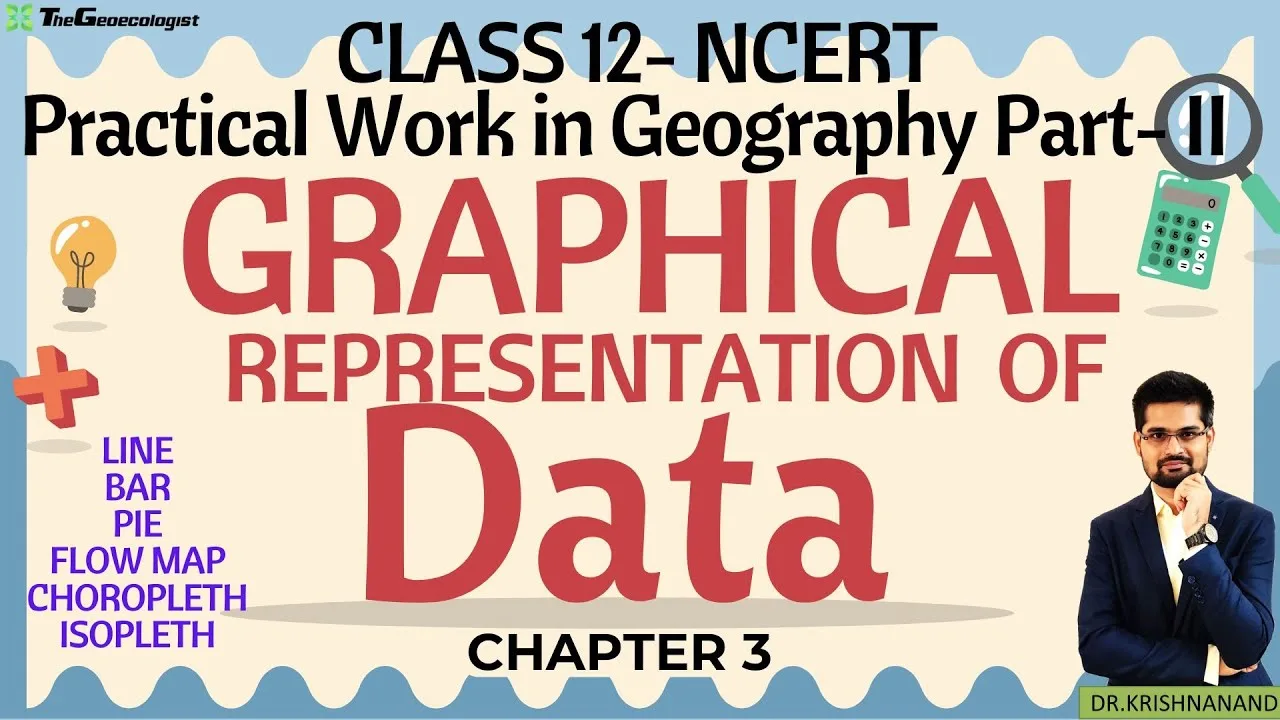
Table of Contents
- Why Graphical Representation Data Matters in Geography
- Core Objectives of Data Visualization in Geography
- Detailed Breakdown of Five Essential Graph Types
- 1. Line Graphs: Mastering Temporal Trends
- 2. Bar Graphs: Categorical Comparison Excellence
- 3. Histograms: Frequency Distribution of Continuous Data
- 4. Pie Charts: Proportional Representation
- 5. Scatter Plots: Correlation Detection
- Step-by-Step Graph Construction Workflow
- Common Errors That Cost Marks in Practical Exams
- Competitive Exam Applications: Beyond Class 12 Boards
- CUET (Common University Entrance Test)
- UGC NET JRF Geography (Paper II)
- UPSC Geography Optional
- Digital Tools for Graph Construction
- Sample Problems with Solutions
- Problem 1: Line Graph Construction
- Problem 2: Histogram with Unequal Intervals
- Problem 3: Pie Chart Angle Calculation
- Pedagogical Approach: TheGeoecologist's Bilingual Methodology
- Advanced Interpretation Skills for High Scorers
- Trend Decomposition
- Comparative Benchmarking
- Distributional Shape Analysis
- Correlation vs. Causation
- Revision Strategy for Last-Minute Preparation
- Frequently Asked Questions
- Can I use a calculator in the Class 12 Geography practical exam?
- What is the difference between a bar graph and a histogram in NCERT marking scheme?
- How many graph types should I master for CUET Geography?
- Is color mandatory in practical exam graphs?
- Where can I find additional practice datasets for graphical representation data?
- Conclusion
The graphical representation data techniques covered in Class 12 NCERT Practical Work in Geography Part-II Chapter 3 form the backbone of geographical analysis for CBSE board exams, CUET, UPSC, and UGC NET JRF aspirants. This comprehensive guide breaks down every graph type, construction method, and interpretation strategy you need to master for academic excellence and competitive success.
- Graphical representation data transforms raw numbers into visual stories for easier pattern recognition
- Five core graph types: line graphs, bar diagrams, histograms, pie charts, and scatter plots
- Proper axis labeling, scale selection, and title formatting are mandatory for full marks
- Chapter 3 carries significant weight in Class 12 practical exams (30 marks practical component)
- Skills directly apply to UPSC Geography Optional, CUET domain tests, and UGC NET Paper II
Why Graphical Representation Data Matters in Geography
Geography is inherently spatial and quantitative. The graphical representation data methods taught in NCERT Chapter 3 enable geographers to visualize complex relationships between variables like population density, rainfall patterns, temperature variations, literacy rates, and land-use distribution. According to the National Council of Educational Research and Training, practical geography constitutes 30% of the total Class 12 Geography assessment, making graph mastery non-negotiable.
Core Objectives of Data Visualization in Geography
The chapter emphasizes three fundamental purposes that every student must internalize:
- Clarity: Condensing thousands of data points into a single interpretable visual
- Comparison: Juxtaposing multiple variables or regions side-by-side
- Trend Analysis: Revealing temporal or spatial patterns invisible in tabular data
Detailed Breakdown of Five Essential Graph Types
1. Line Graphs: Mastering Temporal Trends
Line graphs are the gold standard for displaying continuous data over time. In geographical contexts, they excel at showing temperature fluctuations across decades, population growth trajectories, urbanization rates, and climatic cycles. – a key consideration for graphical representation data.
Construction Protocol for Line Graphs
- X-axis (Independent Variable): Always represents time — years, months, decades, or centuries
- Y-axis (Dependent Variable): Represents the measured quantity — temperature (°C), rainfall (mm), population (millions)
- Scale Selection: Choose uniform intervals that accommodate the full data range without excessive white space
- Plotting Points: Mark each data coordinate precisely; connect with smooth lines for continuous phenomena
- Multiple Series: Use distinct line styles (solid, dashed, dotted) and colors for comparative analysis
Exam Tip: CBSE practical examiners deduct marks for missing units on axes. Always write “Temperature (°C)” not just “Temperature.”
2. Bar Graphs: Categorical Comparison Excellence
Bar graphs dominate when comparing discrete categories — states, districts, countries, or land-use types. The graphical representation data toolkit includes three variants:
Simple Bar Graphs
Single variable across categories. Example: State-wise rice production in India (2022-23). Each bar represents one state; height corresponds to production in million tonnes.
Grouped (Clustered) Bar Graphs
Multiple variables per category. Example: Male vs. female literacy rates across Indian states. Two adjacent bars per state enable instant gender-gap visualization.
Segmented (Stacked) Bar Graphs
Part-to-whole relationships within categories. Example: Land-use composition (forest, agriculture, urban, waste) for each state. Each bar = 100%; segments show proportional breakdown.
Construction Rules
- Equal bar width and uniform spacing between bars
- Bars can be vertical (column) or horizontal — horizontal preferred for long category labels
- Baseline must start at zero for accurate visual proportion
- Legend mandatory for grouped/segmented variants
3. Histograms: Frequency Distribution of Continuous Data
Often confused with bar graphs, histograms serve a fundamentally different purpose: displaying frequency distribution of continuous variables grouped into class intervals. This distinction is frequently tested in CUET and UGC NET. – a key consideration for graphical representation data.
Critical Differences: Histogram vs. Bar Graph
| Feature | Histogram | Bar Graph |
|---|---|---|
| Data Type | Continuous (grouped intervals) | Discrete categories |
| Bar Adjacency | No gaps (touching bars) | Gaps between bars |
| X-axis | Class intervals (e.g., 0-10, 10-20) | Category labels |
| Area Significance | Area ∝ Frequency | Height ∝ Value |
| Width Variation | Can vary (unequal intervals) | Always uniform |
Histogram Construction Steps
- Organize raw data into a frequency distribution table with class intervals
- Calculate frequency density if intervals are unequal: Frequency Density = Frequency / Class Width
- Plot class intervals on X-axis, frequency (or density) on Y-axis
- Draw adjacent rectangles; height = frequency (or density)
- For unequal intervals, rectangle area must represent frequency
Geographical application: Population density distribution across districts, rainfall frequency classes, altitude zone analysis.
4. Pie Charts: Proportional Representation
Pie charts (or divided circle diagrams) visualize part-to-whole relationships where the complete circle represents 100% or 360°. Each sector angle = (Component Value / Total Value) × 360°.
When to Use Pie Charts
- Land-use classification in a region
- Sectoral contribution to GDP (primary, secondary, tertiary)
- Religious/linguistic composition of population
- Export/import commodity share
Limitations to Acknowledge in Exams
NCERT explicitly notes pie chart constraints: difficult to compare similar-sized sectors; unsuitable for more than 6-7 categories; cannot show absolute values alongside proportions without clutter. Mentioning these limitations in practical viva demonstrates deeper understanding. – a key consideration for graphical representation data.
5. Scatter Plots: Correlation Detection
Scatter plots (XY plots) reveal relationships between two continuous variables. Each point represents one observation’s values on both axes. The pattern indicates correlation type and strength.
Interpreting Scatter Patterns
- Positive Correlation: Points trend upward (e.g., per capita income vs. literacy rate)
- Negative Correlation: Points trend downward (e.g., altitude vs. temperature)
- No Correlation: Random scatter (e.g., longitude vs. rainfall)
- Curvilinear: Non-linear but systematic pattern
Line of Best Fit
Drawing a trend line through the scatter cloud quantifies the relationship. In UPSC Geography Optional, candidates often annotate scatter plots with correlation coefficients (r) calculated via Karl Pearson’s or Spearman’s method. – a key consideration for graphical representation data.
Step-by-Step Graph Construction Workflow
Regardless of graph type, follow this standardized workflow for consistent, exam-ready output:
- Data Verification: Check for outliers, missing values, and unit consistency
- Graph Selection: Match graph type to data nature and analytical objective
- Scale Determination: Calculate optimal scale — round numbers, maximum 15-20 divisions
- Axis Drawing: Use sharp pencil, ruler; leave margin for labels and title
- Labeling Protocol: Variable name + unit in parentheses (e.g., “Rainfall (mm)”)
- Title Formatting: Descriptive, specific, placed above graph — “Figure 1: Decadal Temperature Trend in Delhi (1951-2021)”
- Plotting Precision: Plot points accurately; use appropriate symbols (●, ■, ▲)
- Legend & Annotations: Essential for multi-series graphs
- Review: Verify against source data; check visual balance
Common Errors That Cost Marks in Practical Exams
Based on CBSE examiner reports and TheGeoecologist’s analysis of thousands of student submissions, these errors appear repeatedly:
- Missing or incomplete axis labels (no units = automatic mark deduction)
- Non-zero baseline on bar graphs/histograms (distorts visual proportion)
- Gaps between histogram bars (confuses with bar graph)
- Pie chart sectors not summing to 360° (calculation error)
- Inappropriate graph choice (e.g., pie chart for time-series data)
- Overcrowded graphs — too many categories, illegible labels
- Inconsistent scale intervals (e.g., 0, 5, 10, 20, 30)
- No title or vague title (“Graph of Rainfall” instead of “Annual Rainfall in Mumbai: 2010-2020”)
Competitive Exam Applications: Beyond Class 12 Boards
CUET (Common University Entrance Test)
The Geography domain paper includes 5-7 questions on graphical representation data interpretation. Typical question formats: identify graph type from description, select appropriate graph for given dataset, interpret trends from provided figure, spot errors in constructed graph.
UGC NET JRF Geography (Paper II)
Research methodology unit tests graph selection for specific research designs. Questions cover: logarithmic scales for exponential growth, population pyramids (specialized bar graphs), Lorenz curves for inequality, and GIS-based visualization principles. – a key consideration for graphical representation data.
UPSC Geography Optional
Mains answer-writing demands integrated maps and graphs. Toppers routinely embed line graphs of monsoon trends, bar diagrams of crop production, and scatter plots of HDI indicators within 150-250 word answers. The Union Public Service Commission evaluates graphical literacy as part of analytical rigor. – a key consideration for graphical representation data.
Digital Tools for Graph Construction
While hand-drawn graphs remain mandatory for Class 12 practical exams, competitive aspirants should master digital tools for efficiency:
- Microsoft Excel / Google Sheets: Accessible, sufficient for all NCERT graph types
- QGIS / ArcGIS: For spatial data visualization (choropleth maps, proportional symbols)
- R (ggplot2) / Python (Matplotlib, Seaborn): Publication-quality output for research
- Datawrapper / Flourish: Interactive web-based visualizations
Pro tip: Practice constructing every NCERT graph type both manually (graph paper, 0.5mm pencil) and digitally. The cognitive reinforcement transfers directly to exam performance.
Sample Problems with Solutions
Problem 1: Line Graph Construction
Data: Decadal population of India (1951-2011) — 361, 439, 548, 683, 846, 1029, 1210 million.
Solution: X-axis: Census years (1951, 1961…2011) at 2cm intervals. Y-axis: Population (millions) — scale 1cm = 100 million. Plot 7 points, connect with smooth curve. Title: “Decadal Population Growth of India (1951-2011)”. Annotate inflection point at 1981 (growth rate peak). – a key consideration for graphical representation data.
Problem 2: Histogram with Unequal Intervals
Data: Daily wage distribution of workers — 0-50 (12), 50-100 (28), 100-200 (35), 200-400 (15), 400-500 (10) workers.
Solution: Class widths: 50, 50, 100, 200, 100. Calculate frequency density: 0.24, 0.56, 0.35, 0.075, 0.10. Rectangle heights = density. Areas ∝ frequencies. Critical: 200-400 interval rectangle wider but shorter.
Problem 3: Pie Chart Angle Calculation
Data: Land use — Forest 42%, Agriculture 38%, Urban 12%, Water 5%, Waste 3%.
Solution: Forest: 151.2°, Agriculture: 136.8°, Urban: 43.2°, Water: 18°, Waste: 10.8°. Sum = 360°. Draw with protractor; label each sector with category + percentage.
Pedagogical Approach: TheGeoecologist’s Bilingual Methodology
TheGeoecologist’s YouTube channel has pioneered a Hindi-English bilingual teaching model that addresses India’s linguistic diversity. With over 500,000 subscribers, graphical representation data’s Chapter 3 playlist demonstrates:
- Real-time graph plotting on graph paper with verbal commentary
- Side-by-side comparison of correct vs. incorrect constructions
- Previous year board question walkthroughs
- CUET/NET-specific interpretation drills
This multimodal approach — visual demonstration + bilingual explanation + exam-oriented practice — aligns with multimodal learning theory, which shows 40% higher retention compared to text-only instruction.
Advanced Interpretation Skills for High Scorers
Moving beyond construction to interpretation separates 90+ scorers from average performers. Develop these analytical lenses:
Trend Decomposition
For any time-series line graph, identify: secular trend (long-term direction), cyclical fluctuations (business/climate cycles), seasonal variation (monsoon peaks), and irregular components (droughts, policy shocks).
Comparative Benchmarking
When analyzing grouped bar graphs, calculate: absolute difference, percentage difference, ratio, and growth rate between categories. Example: “Kerala’s female literacy (92%) exceeds Bihar’s (51%) by 41 percentage points — a 1.8x ratio.”
Distributional Shape Analysis
For histograms, describe: symmetry/skewness (positive/negative), modality (unimodal/bimodal), kurtosis (peakedness), and outliers. Connect shape to geographical processes — e.g., bimodal rainfall histogram indicates dual monsoon regime.
Correlation vs. Causation
Scatter plots show association, not causation. Always qualify interpretations: “Positive correlation between urbanization and literacy suggests mutual reinforcement, but institutional factors mediate this relationship.”
Revision Strategy for Last-Minute Preparation
- Day 1: Memorize graph selection decision tree (continuous vs. discrete, time vs. category, one vs. two variables)
- Day 2: Practice 3 graphs by hand — one line, one bar/histogram, one pie — timed (15 min each)
- Day 3: Solve 10 interpretation MCQs from CUET/NET previous papers
- Day 4: Review all labeling conventions; create a one-page cheat sheet
- Day 5: Full mock practical: dataset → graph choice → construction → interpretation (45 min)
Frequently Asked Questions
Can I use a calculator in the Class 12 Geography practical exam?
Yes, non-programmable calculators are permitted for calculations (pie chart angles, frequency densities, correlation coefficients). However, graph construction must be manual on graph paper.
What is the difference between a bar graph and a histogram in NCERT marking scheme?
Bar graphs have gaps between bars and represent discrete categories. Histograms have touching bars representing continuous class intervals. Using gaps in a histogram or no gaps in a bar graph loses 1-2 marks per graph. – a key consideration for graphical representation data.
How many graph types should I master for CUET Geography?
All five NCERT types plus population pyramids, Lorenz curves, and climatic graphs (hythergraph, climograph). CUET syllabus extends slightly beyond NCERT Chapter 3.
Is color mandatory in practical exam graphs?
Not mandatory but recommended for multi-series graphs. Use pencil shading patterns (horizontal, vertical, diagonal lines, dots) if color pencils aren’t available. Clarity > aesthetics.
Where can I find additional practice datasets for graphical representation data?
Census of India reports, IMD climate data, World Bank Open Data, and NCERT’s own “Practical Work in Geography” textbook appendix contain exam-appropriate datasets.
Conclusion
Mastering graphical representation data techniques from NCERT Class 12 Chapter 3 is not merely an exam requirement — graphical representation data’s a foundational geographical literacy skill. The ability to select, construct, and interpret appropriate visualizations transforms raw data into geographical insight, serving you from board exams through UPSC Mains and into professional research. Combine diligent hand-drawing practice with TheGeoecologist’s bilingual tutorials, solve previous year papers religiously, and internalize the interpretation frameworks outlined here. Your graphs will not just score marks; they’ll communicate geographical truth.
Ready to excel? Subscribe to TheGeoecologist on YouTube for chapter-wise practical geography tutorials, join the Telegram channel for daily practice questions, and explore paid courses for personalized mentorship. Your geographical journey deserves the best guidance. – a key consideration for graphical representation data.
Frequently Asked Questions
The five main types are line graphs, bar graphs (simple, grouped, segmented), histograms, pie charts, and scatter plots. Each serves a specific analytical purpose for geographical data.
Match graph to data nature: line graphs for time-series trends, bar graphs for categorical comparison, histograms for continuous frequency distribution, pie charts for part-to-whole proportions, scatter plots for bivariate correlation analysis.
Missing axis labels with units, non-zero baselines on bar graphs/histograms, gaps between histogram bars, incorrect pie chart angles summing ≠ 360°, inappropriate graph selection, overcrowded designs, and vague titles.